A history of England’s football kits: from Umbro through Admiral to Nike
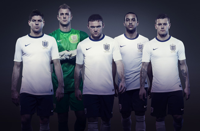
ENGLAND’S new strip – the first from Nike – ends half a century of involvement with Umbro, the Manchester-based sports manufacturer whose name is synonymous with the Three Lions.
As with all new kits, there has been controversy. The Germans have supposedly complained that England are attempting to copy their success by copying the design of their shirts. However, Gary Lineker’s riposte – “If you can’t beat ‘em…” – ignores the fact that the retro kit most closely resembles the Germans of the sixties, when we were still in the habit of beating the old enemy.
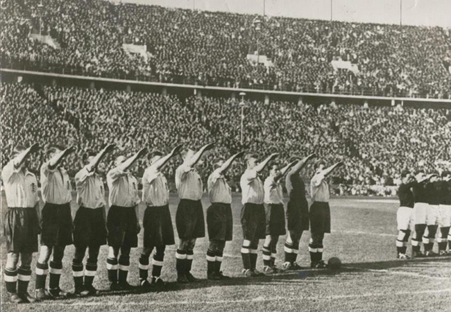
Of course, the England and Germany teams have long shared a basic colour scheme, although the Germans were sporting enough to change theirs for England’s visit to Berlin in 1938, and England responded by giving their hosts a local-style greeting…
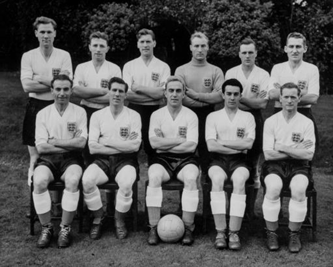
That was in the pre-Umbro days, which began in the mid-fifties when the company signed a deal with the Football Association to produce England strips. Before that, they had long been supplying top professional clubs for decades, and creating innovative fabrics, such as that used in 1934’s ‘Tangeru’ shirts.
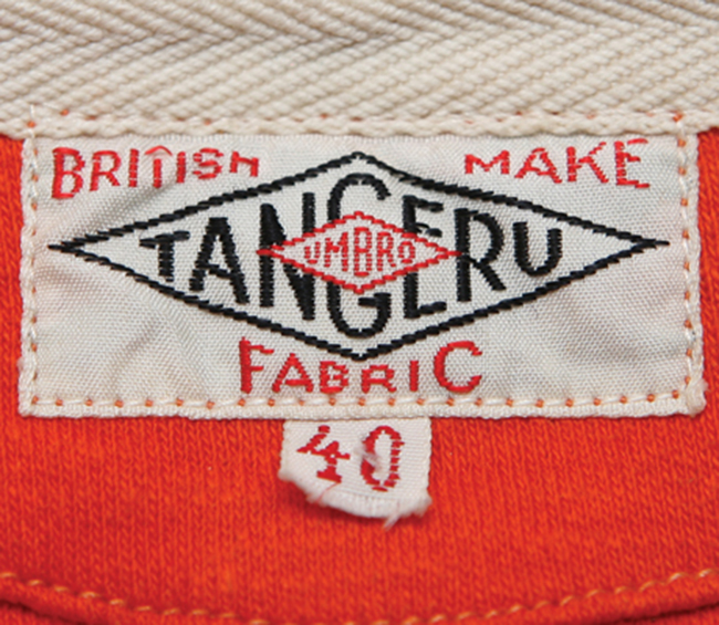
And they were ahead of the game in terms of merchandising too, having produced the first ‘replica kits in 1959.
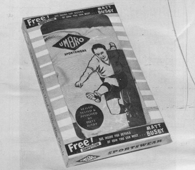
Ironically, Umbro’s first England shirt (1954) was called the ‘continental’, although its plain v-neck was a continuation of the traditional pre-war English style.
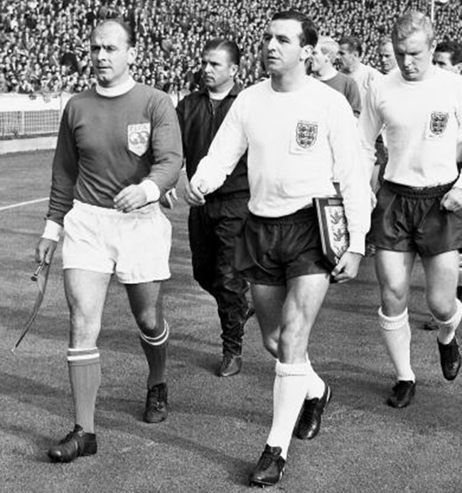
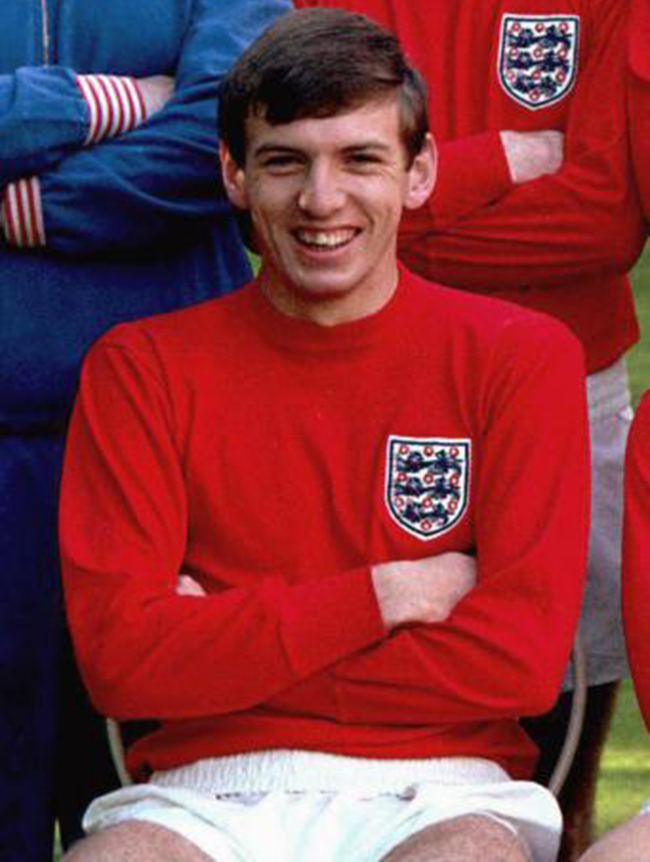
In 1961 Bukta won the contract, and produced a long-sleeved crew-neck design for the FA Centenary match in 1963.
By 1965 Umbro had the gig again, and continued the Bukta look for the ‘iconic’ World cup strips of ‘66.
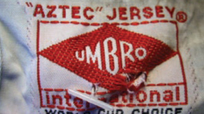
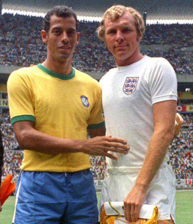
In 1970 the reigning world champions wore lightweight ‘Aztec’ shirts specially designed for the heat of the Mexico World Cup.
The simple design was worn for the last time in 1974, away to Yugoslavia.
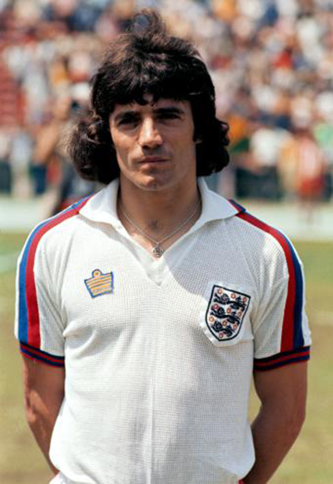
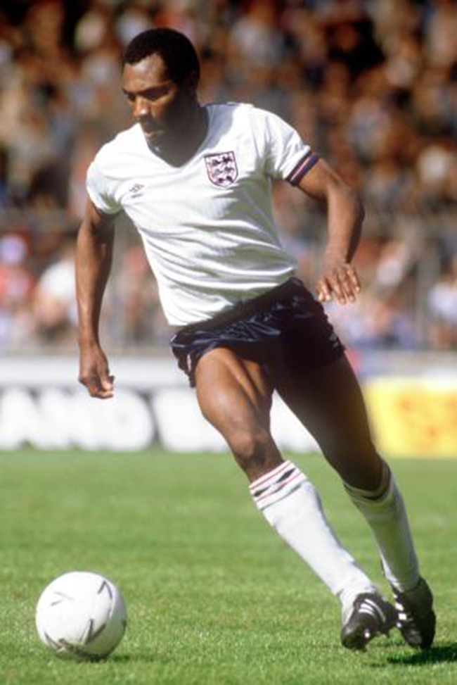
Whereupon Admiral won the rights to manufacture and market the national strip. In 1974 they launched their gaudy monstrosity, replete with horrible red and blue facings. For the first time, the shorts carried the manufacturer’s logo – and it was nearly as big as the chest badge.
By the time of the 1980 European finals they had finessed this look, with a slightly more stylish version, as modeled here by Trevor Francis and Bulldog Bobby.
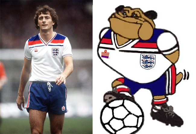
In 1984 Umbro were back, with an understated pinstripe, and, following Admiral’s lead, their own diamond-shaped logo.
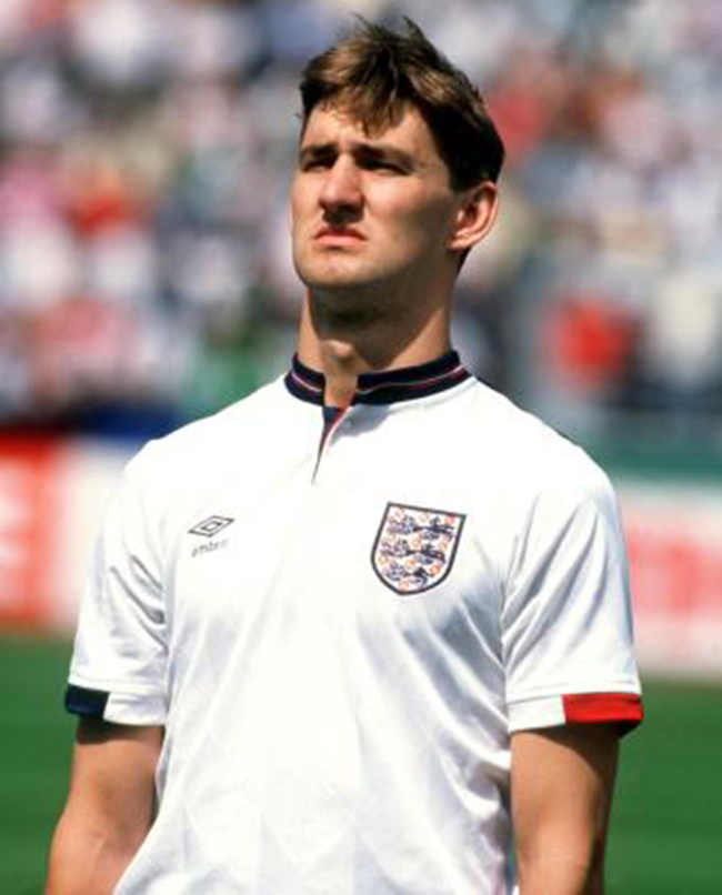
1987 took the commercialisation a step further, as the logo was weaved into the fabric. It also introduced a new artificial fabric, Tactel.
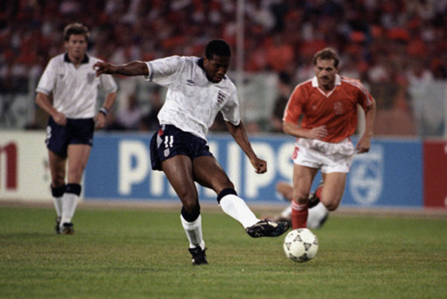
Diamonds all over the 1990 outfit, including a couple of red and white ones gratuitously slapped on the shorts.
1992: Big badge, horrible collar.
1996: Grey strip for a very grey day.
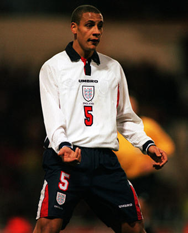
 1997: Changing priorities: Umbro in large letters; England much smaller.
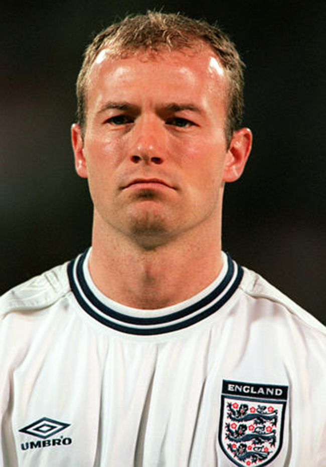
1999 back to the future with a ‘classic’ round collar.
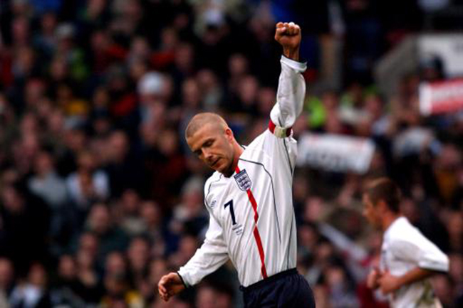
2001 An unpleasant red stripe, and for the first time, the opponent’s name embroidered in the shirt.
2003: Cross of St George on the shoulder and one of the worst sshirt for nearly thirty years.
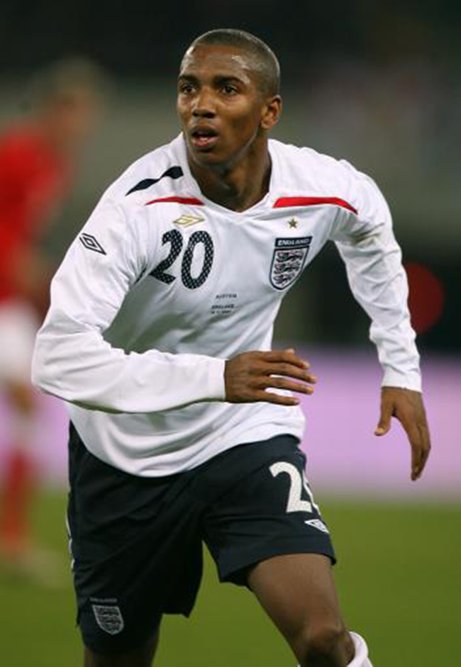
2007: Diamonds again, and a Trilogy fabric that created its own ‘micro-climate’ to ensure players remained at optimal temperature at all times.
2009: This polo shirt looked more suited to watching the game in the pub, but was developed with the involvement of the players, apparently.

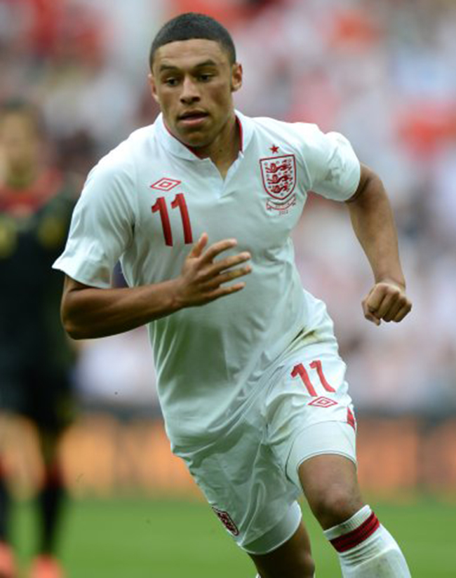
2012: No blue at all in Umbro’s final effort. An unmemorable strip for an unmemorable tournament, as Umbro, like England, went out not with a bang but with a whimper.
Posted: 22nd, May 2013 | In: Key Posts, Sports Comment (1) | TrackBack | Permalink


