Jean Charles De Menezes: Media And Police ‘Doctored’ Image
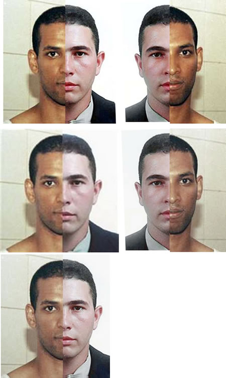
CLARE Montgomery QC, prosecuting, told the court that the picture of Jean Charles De Menzes and Hussain Osman had been altered “by either stretching or resizing so the face ceases to have its correct proportions” in order to make the pair seem more alike.
Beau Bo D’Or attempts to do as alleged:
Having worked with the images that are available, there do seem to be lightness, saturation, (possibly) contrast and minor angle of photograph issues.
Then there is the cropping of the photograph.
The media seem to be showing a cropped image of the police handout which does show a misalignment of the top of the heads.
If I hadn’t discovered the police handout, I would have said the image was judiciously cropped to obscure this misalignment but it wasn’t – the media have done this.
Do remember that I can only go on what I have seen published. Perhaps there are better resolution images in the hands of the experts but the lightness and contrast issues could account for the loss of detail on the De Menezes ’side’.
It does surprise me that the police handout does seem to be more degraded than images I can find on the net but I don’t know if these are the exact source photos used in the composite but I believe they could well be.
The big BUT is, though, why align the left hand side of someone’s face with the right hand
side of someone else’s ?Faces aren’t symmetrical. If you are comparing likenesses, you compare the whole to the whole, not manufacture a hybrid.
And, what if you were to compare the other side of the faces as I have done.
Now, I haven’t aligned faces. What I’ve done is look at what I can best approximate are the mirror images of the faces. i.e. hide the sides that were show side by side and reveal the opposites in the same alignment as the mirror images were.
Please note that I created my own composite of the Met Police one (which has greater contrast) and that is the one on the top.
The original Met Police image is below that one. There is a slight difference in face size which does give a slightly more obvious misalignment at the top of the head (probabbly exacerbated by the higher contrast) but the width of the faces and alignment of the facial features do seem to give a different impression.
Update – I have amende my own images and adjusted the size of Mr De Menezes head (in both top images and in proportion) to reduce this alignment.
Further update – I have now reduced brightness, contrast and saturation (on both sides of my own composite) as best I can to mimic that of the original and placed the opposite (reduced contrast etc.) to the right of the original. My own (reduce contrast etc.) appears below the original.
Posted: 19th, October 2007 | In: Reviews Comments (8) | TrackBack | Permalink


