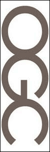
That Office Of Government Commerce Logo Uncensored
 SAYS a spokesman for OGC: “It is true that it caused a few titters among some staff when viewed on its side, but on consideration we concluded that the effect was generic to the particular combination of the letters OGC – and it is not inappropriate to an organisation that’s looking to have a firm grip on Government spend.”
Brand expert Michael Hamilton tells the Telegraph: “They’re going to get more column inches than they could ever have expected before. If I were them, I would be pretty pleased.”
Fnar…
Posted: 24th, April 2008 | In: Money, Photojournalism, Politicians Comment (1) | TrackBack | Permalink


