High Rise: see the movie props that hark back to 1970s Briton
High-Rise is a vision of hell set in the 1970s. It’s a bit like the EastEnders omnibus, only without the nightmarish Shane Ritchie. In the Creative Review, Mark Sinclair interviews graphic artists Michael Eaton and Felicity Hickson:
Ben Wheatley’s High-Rise, looks at mid-70s Britain through the prism of an ultra-modern tower block. Adapted from JG Ballard’s 1975 nove by Amy Jump, the film follows Dr Robert Laing (played by Tom Hiddleston) as he adjusts to his new life as a tenant on the 25th floor and explores the relationships between the building’s various social groups and the tribal mentalities that emerge as the tower gradually descends into chaos. While working families live on its lower levels and aspirant professionals reside halfway up, a wealthy elite is confined to the uppermost floors – a structure that does not last long.
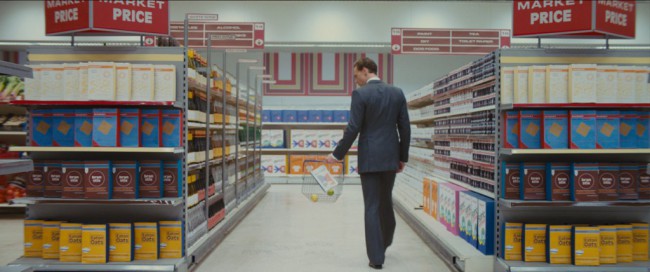
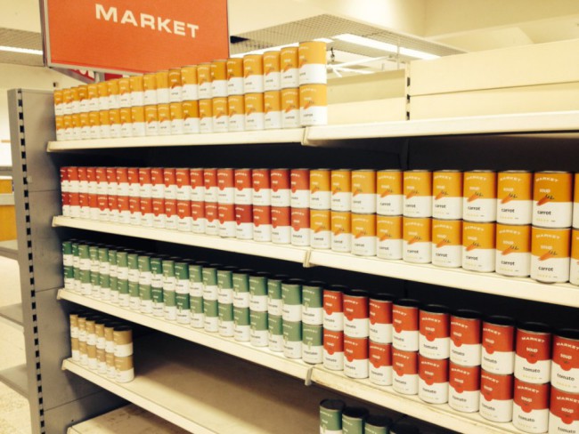
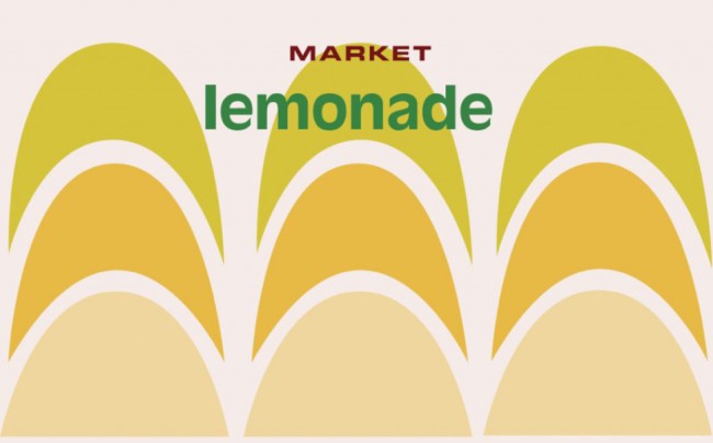
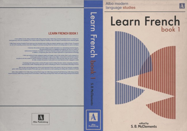
To help realise this unique world, envisioned by production designer Mark Tildesley, graphic artists Michael Eaton and Felicity Hickson created a legion of objects and products and several type treatments for the film’s locations: one for the high-rise itself, with its supermarket, gym, spa and swimming pool; a house font for the building’s architect, Anthony Royal; and signage for Laing’s place of work, the School of Physiology.
Nice work – and if it does make more than a passing nod to Sainsbury’s own-brand.
Posted: 10th, March 2016 | In: Film, Key Posts 0 Comments | TrackBack | Permalink


