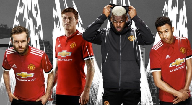
Manchester United’s new kit is a study in corporate misery
We usually see this kind of moody pout on the cover of Christmas books aimed at middle-aged men, you know the things with Jeremy Clarkson, Gordon Ramsay or some celebrity memoirist on the cover. They always look cheesed off with life. At the Manchester United kit launch players contrived much the same miserable look. We got Juan Mata is full proctologist mode. Paul Pogba looking affronted. Jesse Lingard anxious, adopting the pose of a man living in constant fear of a ball to the knackers. Victor Lindelof opted to be shrink-wrapped and laminated.
Manchester United’s stocking filler is the club’s new shirt, which looks a lot like the old shirt. It’s red. It’s got a blinged Swiss flag on it. And it’s got Wayne Rooney in it.
But it’s different. This one is red with black and white cuffs (supposedly inspired by the flags waved at Old Trafford on matchdays) and has a neat little button-up granddad collar. And that’s it.
So similar are old and new kits that clubs should invite fans to spot five differences to qualify for a discount.
Posted: 3rd, July 2017 | In: manchester united, News, Sports 1 Comment | TrackBack | Permalink


